Overview
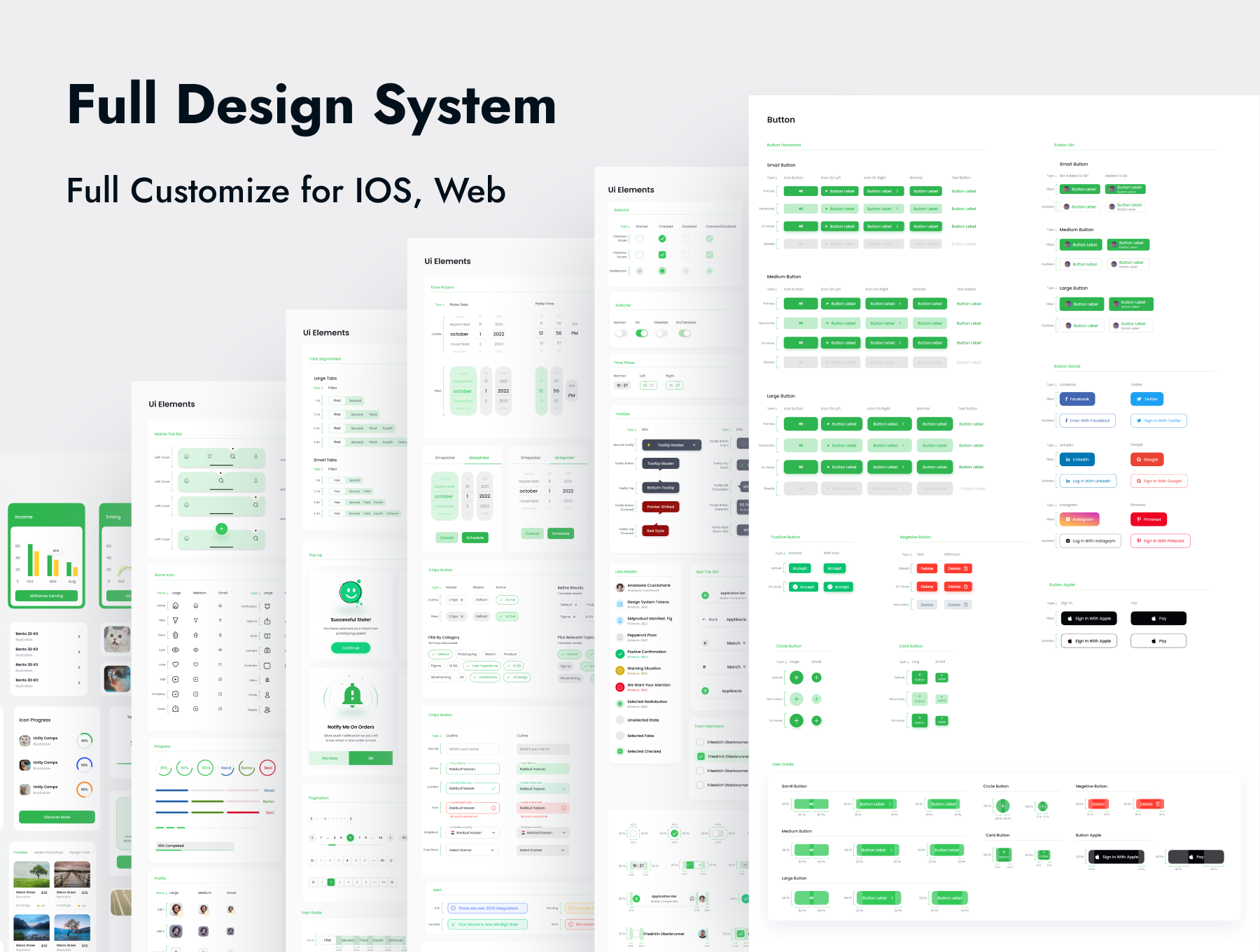
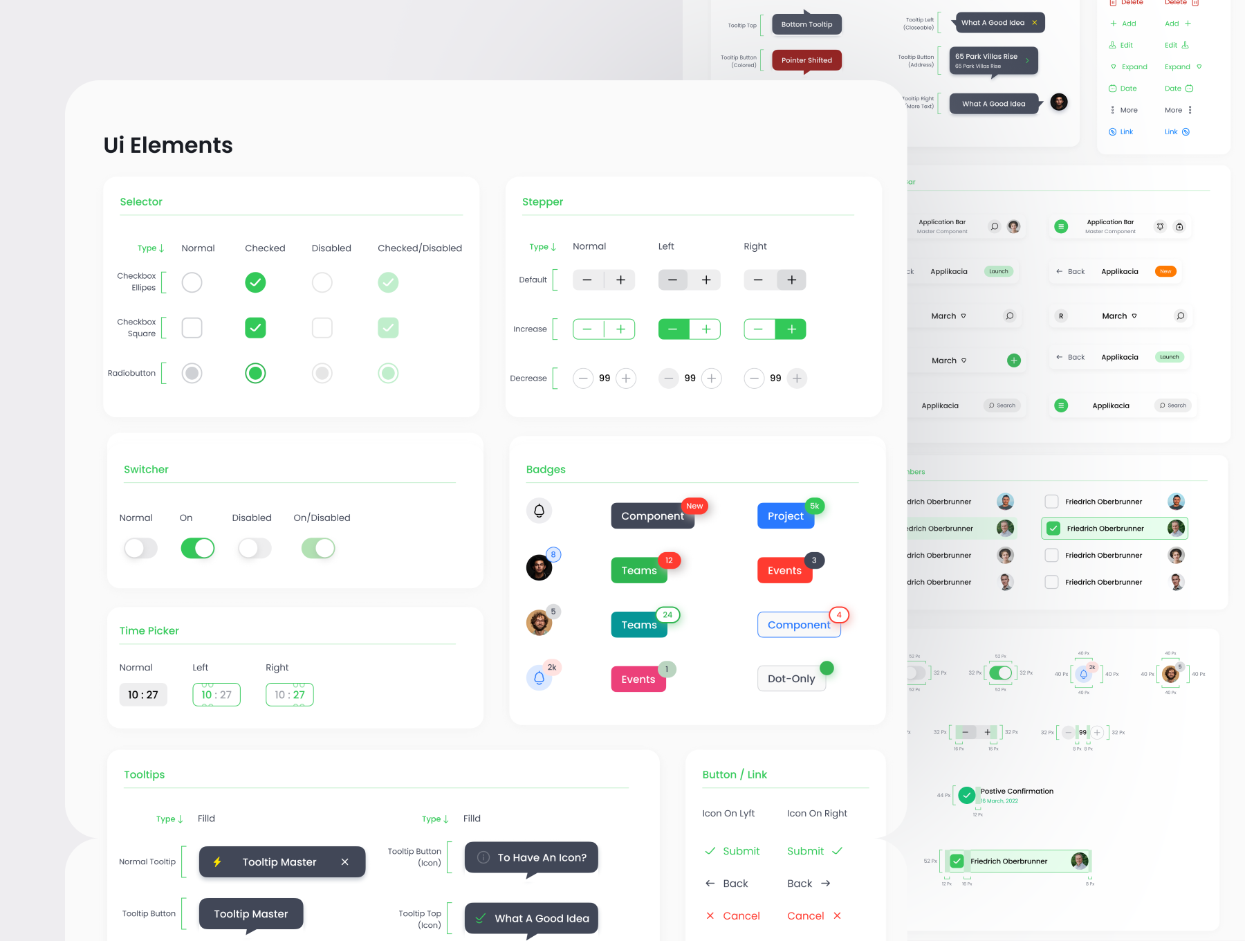
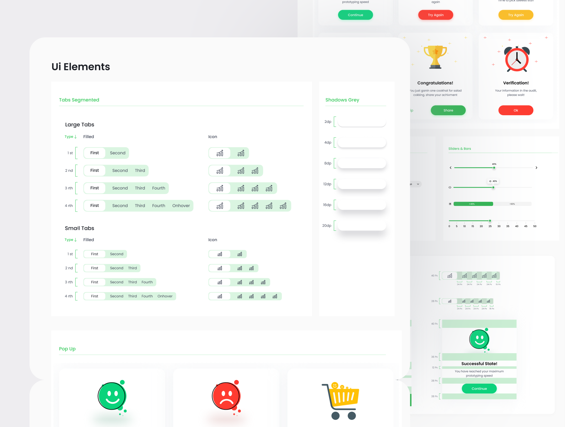
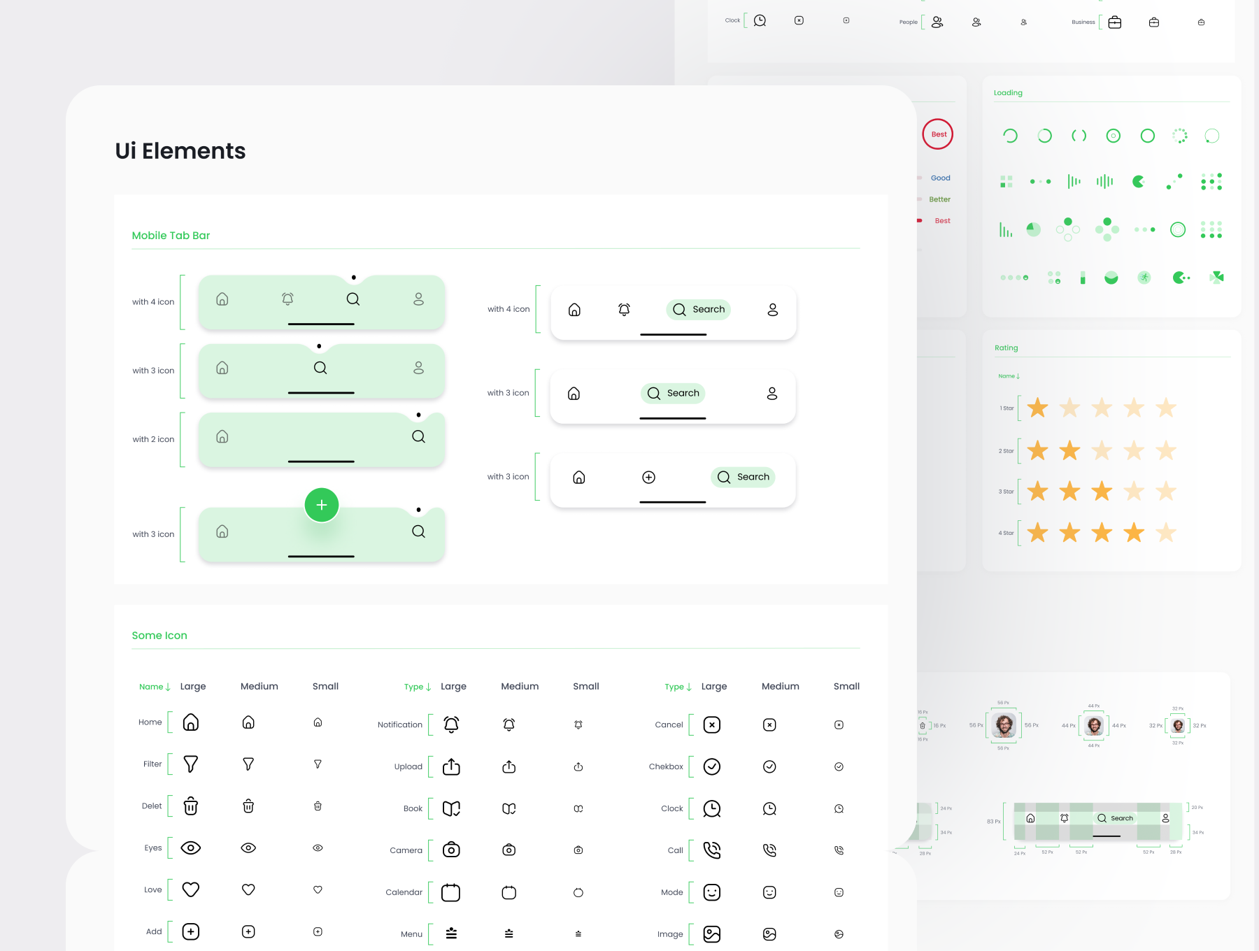
So happy to announce that after five months of extensive work and collaboration, Justuno has a new home. We've helped re-energize their brand to target a more upscale market, upgrade UX by re-structuring primary user flows and website architecture, and introduce a new design language, product visuals, and design system to support the modular CMS environment which we built using WordPress.
The client
Justuno is an omnichannel platform that enables digital marketers to engage website visitors, increase conversions and gain customer insights with advanced targeting and robust analytics by building and tracking on-site promotions and campaigns.
With offices in San Francisco and Austin, Justuno is on a mission to provide robust marketing solutions to help convert clicks into customers.
The challenge
Justuno was in dire need of some brand re-focus, visual consistency, and improved user experience. Their current website and CMS weren't meeting their marketing team's needs while their product team was preparing to launch a new, more robust platform. It was time to bring it all under one consistent brand.
Our goal was to upgrade the overall look and feel of the website with a focus on more enterprise customers, bring back some creativity and quirkiness to the brand, provide visual consistency, improve core web vitals, emphasize value attribution, and build fast, easy-to-use CMS for their marketing team.
The solution
After extensive market research and data analysis, we've defined actionable opportunities to re-focus Justuno towards a more upscale market. We pushed for an identity that is uniquely Justuno but focuses heavily on their customers.
We've introduced a more human-centric approach focusing on personalized onboarding, excellent customer service, clear content, and messaging. We've built a website that emphasizes human value and specific use cases to help customers pick Justuno.
